E.E.E.I. |
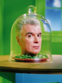
The 2004 Wired Rave Awards: Art: David Byrne For bending our minds with PowerPoint Slides Wired Magazine, Issue 12.04 : April 2004
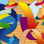
PowerPoint is best known for mind-numbing presentations that transform bumbling salespeople into confident, corporate warriors. But David Byrne used the software to produce evocative — and controversial — art. Here are a few bullet points, as told to Blaise Zerega, about Byrne's PowerPoint conversion and his book/DVD Envisioning Emotional Epistemological Information: • A big part of American culture is business culture. I owe it to myself to acknowledge it, to say, OK, this is part of my life, part of my work, part of the world I live in. • PowerPoint can make almost anything appear good and look professional. Quite frankly, I find that a little bit frightening. • Slickness is not always something that is desired. It's just trying to knock you over, trying to hype you up. That's a danger if there's actually nothing there. • Sometimes when you put on the mask or the clothes of a character, you take on some of the aspects of the character. I guess that's what happened to me. I found that I was enjoying it. • In one of my favorite images, lots of overlapping words are tightly layered on top of each other. One of the few recognizable words is overwhelmed. • Galleries are my obvious venue, but I find that my presentations work very well in public, non-art spaces, places where people who work in offices can interact with it. They gasp and say, "Oh my god, that's done with PowerPoint!"
|


